
Red means “stop,” green means “go,” and yellow means “caution.” At least that’s what they mean on the road. These are basic representations of certain colors to which we have grown accustomed. However, when you leave the road and enter a creative or corporate environment, the meanings behind these colors shift completely. For instance, when you’re driving down the road and you see a green light ahead, you think to yourself, “Okay, I can keep going. It’s safe.” However, when you see green on a company’s website or in its logo, your subconscious reaction is likely entirely different. It probably contains words along the lines of “natural,” “environmentally friendly” or “peaceful.” This subconscious reaction is something that psychologists and marketers everywhere are very aware of, and they often use their knowledge as a basis for the design of a company’s image.
It takes the human eye and the mind fractions of a second to see, process and judge. This means that an audience viewing a website will subconsciously form their complete opinion–its ethic, brand, mission, values, etc.—within the blink of an eye. So, the question remains, “what colors send what messages?”
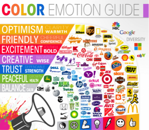
- Blue: Generally perceived as trustworthy, responsible and secure. Blue is a very common color in industries where dependability is a key factor in company success. It is, statistically speaking, the most universally liked color, and is commonly used in conjunction with technology (Dell, HP) and money (American Express, IBM).
- Green: As previously mentioned, green is a strong signifier of health, peace and the environment. It is most commonly seen within companies that are either directly related to the outdoors and nature, such as John Deere, or companies that see themselves as an embodiment of all that is fresh and natural, such as Tropicana and Subway.
- Purple: Purple is very appealing to the creative. It is not a color that, historically, is typically associated with strength, trust, power or any classic symbols. Purple is much more abstract. If used correctly, purple can be very appealing, as it stands out and differs greatly from the norm. Companies who use purple dominantly tend to be those that follow these ideals, such as Aussie hair products and Monster search engine. Purple is also very prevalent within the creative realm, being a favorite of Marketing and Graphic Design firms that stress themselves as being “different.”
- Red: This color has an actual, physical effect on the human body. Upon sight, red increases the heart rate and causes more rapid breathing. Red, like purple, is a difficult color to use correctly. Too much, and a viewer or customer could be instantly turned off, even threatened. Red is very overpowering and very easy to be misinterpreted. If used correctly, however, red can evoke passion from the viewer. It is bold and memorable, and in some cases, such as with Coca-Cola, worth the risk.
- Yellow: Consistently and universally associated with sunshine and happiness. The eye also sees a certain shade of bright yellow more quickly than any other color. It is always viewed as a positive and happy color. Its most notable use: McDonald’s.
- Orange: Cheerful and childish. Children are very drawn to the color, and it portrays fun. It does an excellent job of combining red’s boldness and yellow’s softness to create a fun, likeable color. It is not a color to use excessively within serious business, but more in entertainment or dining—places where fun is acceptable. Nickelodeon uses the color very well.
- Black and White: Often used in conjunction, these colors are, like red, very bold. They imply straightforwardness and organization, and if the balance between the two is good, they are very sharp, sleek and aesthetically appealing.
Every color sends a different message, and it should be one that meshes with a company instead of clashes with it. For instance, a butcher with a green-themed logo and website would likely confuse customers and lose some business based on the mind’s associations with the color as well as the profession. Much like a vegan restaurant shrouded in red would confuse potential diners. It is very important that companies appropriately use and balance colors in a way that will benefit and compliment themselves in every aspect of their being.